# We needed change
# Grappling over the core identity of PUBG branding
# Survival of the fittest, expandability, and modernity
# PUBG gets a new outfit (logo)
# New face of ‘PUBG: BATTLEGROUNDS’ (font/symbol)
# PUBG never stops
# We needed change
‘PUBG: BATTLEGROUNDS’ grew rapidly over the past four years and ‘Battlegrounds’ took firm roots in the hearts of users. PUBG had no intention to stop there, but planned to develop even a greater variety of contents in the future by expanding the IP, and thus needed to reorganize its branding.
A big picture was drawn that would connect each of the contents organically in a single ‘PUBG universe.’ It’s similar to Marvel Studios that releases movies with different stories, but its viewers naturally being aware that the stories are all intertwined within the Marvel Universe. PUBG began its renewal with the goal of having users easily becoming aware of the PUBG franchise by intuitively demonstrating that there are various entertainment contents such as games, movies and novels of various genres under a single brand.
Furthermore, when mentioning the game product of Battlegrounds, English-speakers call ‘PLAYERSUNKNOWN’S BATTLEGROUNDS’ in short as ‘PUBG,’ while users in Korea call it ‘Battlegrounds’ or as a shorter form of ‘Baegeu.’ It was also an opportunity to clear up the difference in names in Korea and abroad. For this, there were opinions among members to not just renew the brand, but also reorganize the visual creativeness accordingly.
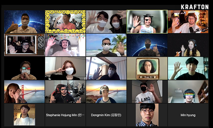
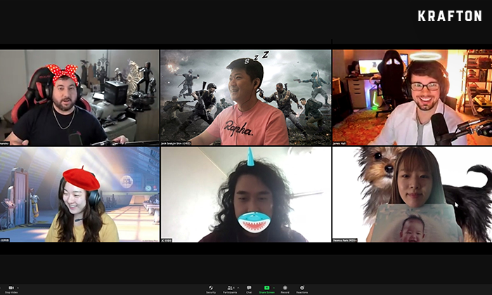
Projects are led mainly by the Central Creative Dept. The Central Creative Dept is the team that oversees the global creative contents of various games produced by KRAFTON, and it produces not only game title logos, but also trailer videos, various social contents, etc. Of the 25 members of the entire office, about half work in Seoul and the rest in Santa Monica. For this project, three people working in Seoul and three in Santa Monica, for a total of six, picked each other’s brains. We will now introduce the eight-month journey of fierce brainstorming that transcended the limitations of different time zones.
# Grappling over the core identify of PUBG branding
The first priority was to think about what the core element of the PUBG brand should be taken forward. Discussions were held with several relevant departments such as the PUBG Universe Dept. Listening to various opinions and trying to narrow down the direction to find a single goal was not an easy task. After several meetings, it hit us that gathering the opinions of not just relevant departments, but all of our members and fans might just give us a hint.
We immediately made an online survey and distributed to key members. Also, we listened to the opinions of all of the KRAFTON staff through a slack channel that was opened to everyone. We asked numerous questions such as, “What do you think are the strengths and weaknesses of the current PUBG brand?” and “What do you think about the brand color?” In addition to responses on the direction of the PUBG brand, we were able to hear many detailed opinions such as some thinking that it would be better to remove the texture of the existing PUBG logo, that the color was too dark, etc.
The opinions of fans were collected by an organization in charge of internal publishing and studio management. We carefully monitored the opinions of fans such as what they thought about the brand, whether the direction desired by fans was consistent with the direction that we intended to proceed with, etc.
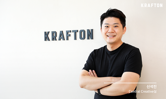
I want to contribute to the brand through visual creativity, while presenting experiences that will be remembered by fans. I think that the Central Creative Office is a team that stands at the contact point between game development and fans. You can say that the identity of PUBG desired by fans was naturally melted into this branding process.
– Seokjin Shin (Josh Shin) (Central Creative Department)
# Survival of the fittest, expandability, modernity
After lengthy discussions, we were able to reflect the opinions gathered both internally and externally to summarize the direction of the renewal of PUBG into three keywords.
The first was ‘survival of the fittest.’ The PUBG Universe can be best summarized as survival of the fittest. Battlegrounds is a game where only one person or one team survives out of the hundred people that enter the game. It appears that ‘survival of the fittest’ where only the group that adapts best to the environment can survive is the true essence of this game. We thought that the sense of survival and ferociousness that can be felt while playing Battlegrounds was the core identity of PUBG. We came to the conclusion that instead of trying to come up with something completely new, it would be better to inherit and develop the existing identity of PUBG, that is ‘survival of the fittest.’
Second, when producing various contents based on the PUBG franchise, it should be possible for the universe and identity to change flexibly according to it, and therefore, we focused on the ‘expandability’ of the brand. In particular, because of the popularity of Battlegrounds, the first thing that comes to mind among many Korean users when hearing ‘PUBG’ is FPS and battle-royal genres, and therefore, we must strive so that PUBG is not limited to a specific genre. Just as consumers accept brand names like SAMUNG and LG as a proper noun, we thought about how to make PUBG’s brand name also a proper noun. That’s because it must be possible to intertwine the identity of PUBG seamlessly in all games or the PUBG universe.
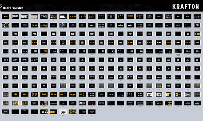
Third, it must have ‘modernity’ so that it could continue on even after the next 10 or 20 years. As the logo is exposed in various games and mass media, it required an especially great amount of consideration. There were 4-500 drafts made reflecting the various opinions of members and fans. We intended to try making everything possible with the combination of the four letters of ‘PUBG.’ But of the numerous plans Bs, it was difficult to find the draft that would satisfy all three directions. Just as maintaining the existing identity of ‘survival of the fittest’ while developing the universe was set as the main direction, it was also decided to inherit the tone and manner unique to PUBG in terms of visuals.
We now unveil to the world the new PUBG that was made through countless meetings and production and revision of numerous prototypes.
# PUBG gets a new outfit (logo)
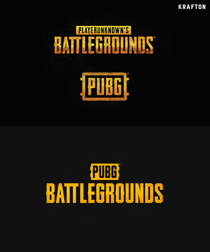
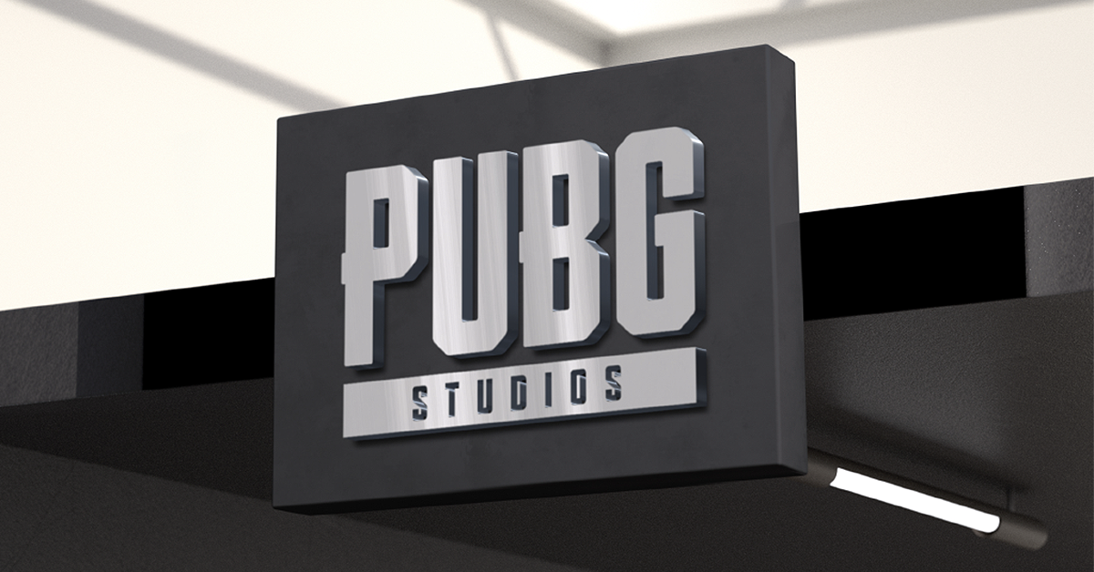
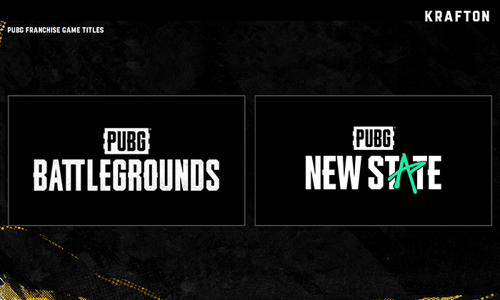
The biggest change was that the game name was changed from ‘PLAYERSUNKNOWN’S BATTLEGROUNDS’ to ‘PUBG: BATTLEGROUNDS’ and the change of the logo arrangement. In order to intuitively convey that it is a game of the PUBG brand, the PUBG logo was placed on the center-top of the Battlegrounds logo. When the next game is released, the top PUBG logo can be used in the same manner to give the message that it is a game spun off from the same universe. From the past PUBG logo, the slightly protruding design elements of the ‘P’ and ‘B’ areas, the background that resembles a dog tag, etc. were maintained and the ‘survival of the fittest’ identity unique to PUBG was inherited.
The color was changed as well. It was made slightly brighter and texture was reduced to improve legibility. This was done by actively mirroring the opinions of members. Since more contents will be produced when various games are released and it will thus be exposed to more media outlets, so the color was adjusted to stand out more. Many users connect to PUBG using mobile devices these days. And because the logo is much smaller in mobile environments, the graphic motif in the shape of a dog tag was simplified and was used as a background element, thereby making the presence of PUBG stand out even better.
Meetings needed during the development process were held through video conference calls usually in the early morning. The team members are far apart – in Seoul and Santa Monica – and because of the time difference, work always starts at 8 or 9 a.m. Collaboration was not easy, but project management tools were utilized as much as possible to work together regardless of the physical environment. It is a collaboration tool that can check the schedule and progress of various projects online. Especially in the case of video production, feedback for each frame has to be shared, and there are limitations working only through e-mails and video conference calls. Using the tool made it possible to communicate in detail about visual creative work, and the team members were able to quickly complete the work despite being located in Seoul and Santa Monica.
# New face of ‘PUBG: BATTLEGROUNDS’ (font/symbol)
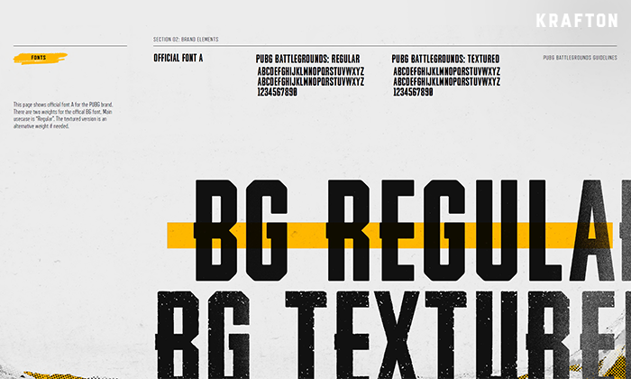
While rebranding PUBG, the brand identity creative of Battlegrounds, which is the game product of the PUBG brand, was also renewed. While producing the new logo and the identity of Battlegrounds became clearer, our need for a unique font became more pressing. This required a lot of time and effort, but the project continued with font development for a complete branding. The curves for each alphabet were cut at 45 degrees to give details to edges, thus giving it a more modern and bolder look. The strength of Battlegrounds and the survival of the fittest identity was once again revealed in the small details.
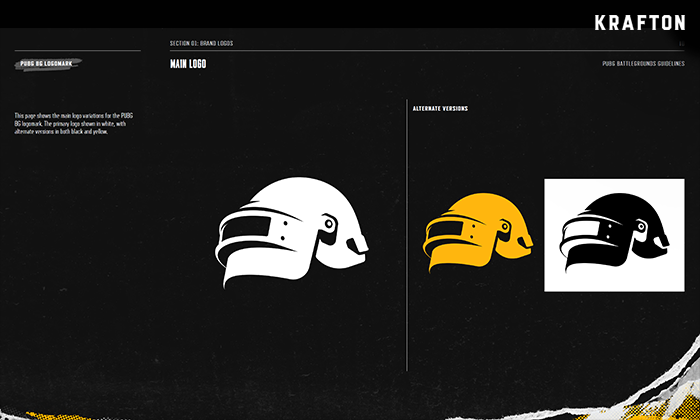
In addition to the logo and font, we produced a new symbol as well. The task to create a symbol was quite arduous. We started by thinking about what element represented Battlegrounds, such as parachutes or airplanes. The item that received the most votes in a member survey was the lone survivor. ‘The lone survivor’ wearing the ‘level 3 helmet’ also appeared in the main visual creative including posters, and therefore, it was judged to be a familiar item for fans as well. And having the level 3 helmet or not while playing also changes winning rates, and therefore, it was suitable for representing the identity of survival of the fittest as well.
There were many drafts for this helmet symbol also. 3D modeling was conducted and after producing numerous drafts, the current symbol was born. The helmet in the symbol has the same angle and shape as shown in the level 3 helmet man in the main poster. The level 3 helmet seen straight ahead may be difficult to identify, and therefore, the symbol was created at the most familiar angle for fans in order to make out what it is instantly from wherever.
# PUBG never stops
With the completion of Battleground’s final logo, font, and symbol, the eight-month journey of the Central Creative Office was completed. Through this project, we will strive to make it possible for fans to view PUBG as a franchise brand. This is just the end of one project. We plan to continue making various IP branded contents including for PUBG under the vision of the Central Creative Office to build a “New type of creative.”
No matter how small the change, we believe that it is necessary to focus on the act of transforming constantly. This is because brands should never stop developing while ceaselessly deliberating on feedback of fans and the directions that the game should take. We will continue to listen to the voices of members and fans and never stop growing.
We wanted to deliver the message that we are continuously transforming. We are striving to constantly maintain and develop, while not losing the identity of PUBG that our fans love. There is failure only if there is challenge, and I believe that unique creations are born through this process. That is why we will continue to take on challenges.
– Seokjin Shin (Central Creative Office)
